
To Graphite and Beyond
by Dirk Dzimirsky
You may already know that even the softest graphite pencil can only produce a grey tone. When you try to push it further by applying more pressure, you are not actually creating a darker value—you are simply compressing the graphite, which results in an unwanted sheen.
The darkest tone a graphite pencil can produce is determined by its material properties. There is no way to turn grey graphite into a truly rich black, no matter how hard you press. A helpful comparison is painting: once you have applied an opaque layer of paint, pressing harder with the brush will not make the color any deeper.
In the photo below, you can see this clearly. Even with strong pressure, the 8B graphite pencil (first from left) develops a visible sheen instead of achieving a deeper black. The tone is similar to that of step 16 on the grey scale below.
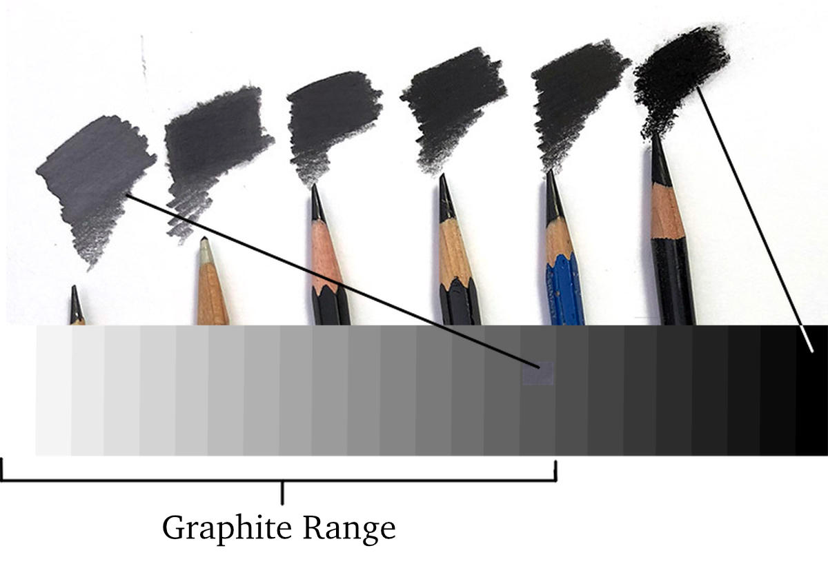
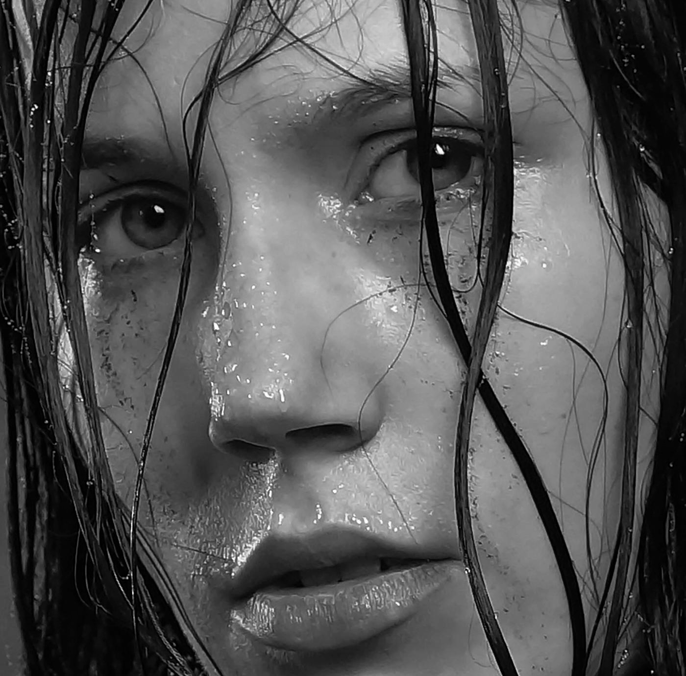
So what happens when a photo contains a range of dark tones? The example below simulates an image drawn with correct tonal values up to step 16 in our grey scale example. For anything darker, the same tone (step 16) is used, resulting in flat areas where detail is lost and everything merges into a uniform grey.
Since this limitation clearly does not produce satisfying results, many artists try to compensate by shifting the entire tonal range toward the lighter end of the scale. In practice, this means treating level 16 as the new “black” and working from white down to that point. This approach preserves some of the tonal relationships and can make the greys appear darker than they actually are. (See image below.)
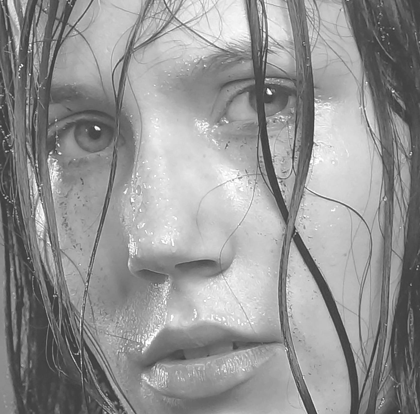
However, the result still is rather flat and lacking in depth. Without a true dark range, there is no solid base for the tones, and the contrast between light and shadow remains weak—reducing the overall clarity and impact of the drawing.
If this concept is new to you and you have only worked with graphite pencils so far, take a moment to critically compare the tones in your drawings with those in your reference photos.
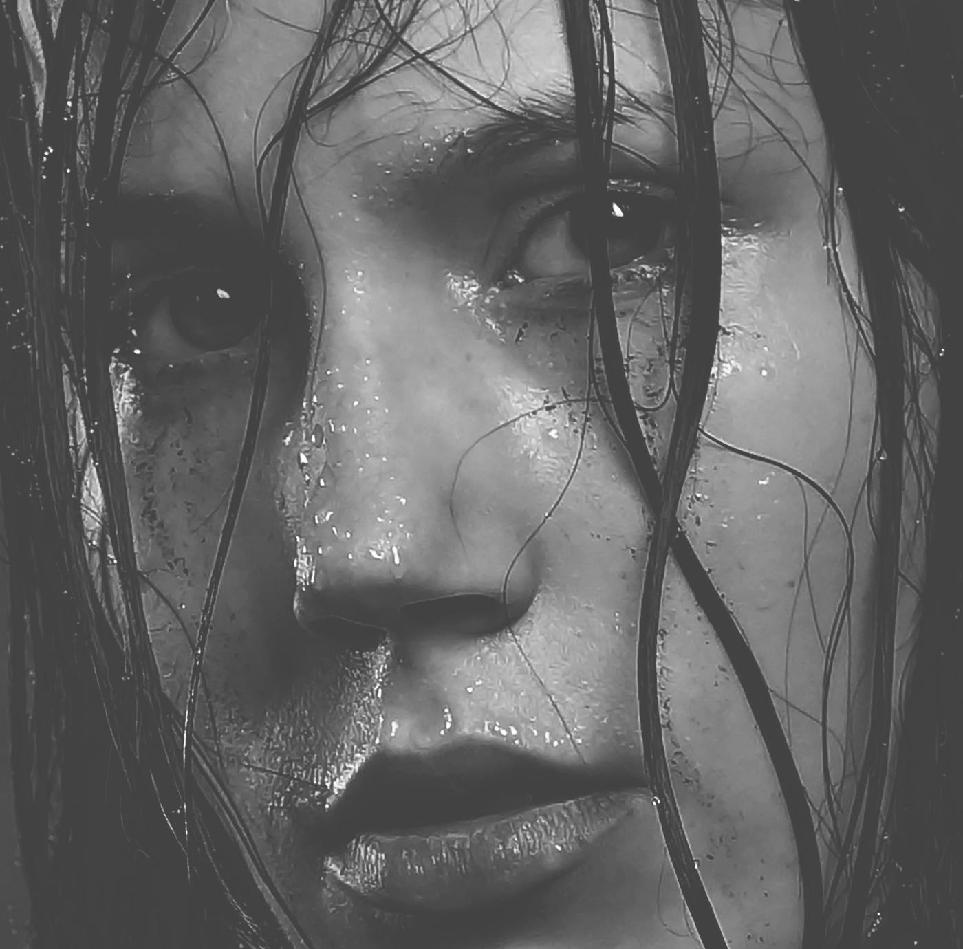
In a portrait, for example, focus on the skin tones. Print your reference image and isolate an area so you can compare it directly to your drawing. In most cases, you will be surprised to see how much lighter your drawn tones are compared to the actual values in the reference.
If you are like many artists, you appreciate rich, deep blacks in your drawings. When limited to grey tones, we lose the ability to create strong depth, achieve high contrast, preserve detail in darker areas, and ultimately bring the drawing fully to life.
So how can we expand our tonal range and still draw mainly with graphite?
The answer is to introduce additional materials beyond graphite for darker tones than a dark grey. Combining graphite with other types of pencils requires some practice, but the results are well worth the effort.
In the following, you will learn how to use these combinations to achieve deeper tones and bring greater depth and impact to your drawings.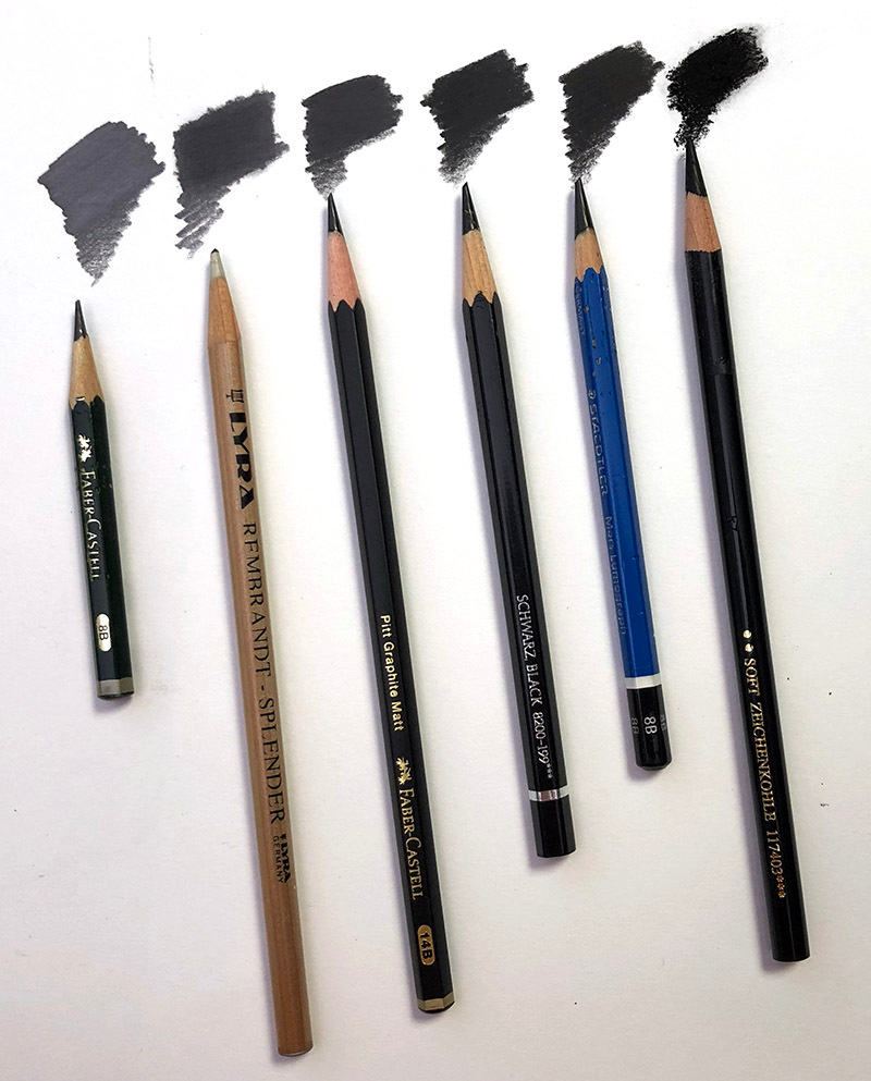
Let's go through the pencils options in the photo above from second left to right:
One easy way to darken graphite and reduce shine is to go over it with a colorless blender pencil like the Splender. This is quick, works well for lighter drawings, and adds more depth.
Another option is the matte graphite pencils from Faber-Castell. The 14B gives results similar to the Splender.
For darker tones however, you can also use an actual black color pencil. Some products are darker than others depending on the brand. The Faber-Castell Black is not too bad.
My go-to pencil, and darkest so far, is the Staedtler Lumograph Black 8B. (in the photo is still the old pencil style, they are not blue but black now), which is probably a carbon pencil.
These pencils don’t blend as smoothly as regular graphite. For blending these dark pencils, I primarily use a brush. Larger areas would be challenging, but you don't actually want large areas to be just pure dark. Think of a graphite drawing as an HDR photo (High Dynamic Range). Such a photo omits no information, you can clearly see all information in the darks - so there are no large pitch black area.
Also, keep in mind that they won't adhere to graphite layers that have been applied with a lot of force, creating a very slippery surface. Use pencils directly on the paper or over layers of medium pressure graphite.
The last pencil on the picture is charcoal (Faber-Castell PITT Soft). To demonstrate how much darker it is in comparison to the other pencils, I drew it on top of each other pencil. The tones are exactly the same as in the picture above but only now you notice how grey most tones still are - especially the 8B graphite.
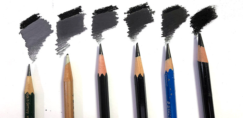
Charcoal appears much darker because it is completely matte and does not reflect light as the others do, including the Staedtler Black.
Unfortunately, pure charcoal and graphite do not mix well. I therefore never combine it with graphite. In addition, it has a very different appearance from graphite.
From now on, we will use Staedtler Black with graphite whenever it is needed.
I encourage you to experiment with various pencils and methods to get darker tones in your graphite drawings. Make sure you are aware of the limitations and the possibilities of your material before you start any drawing project and check upfront how close you can actually reach the tones from the photo. You will make better choices regarding your reference photos and also will have less struggle because you are not trying to achieve something which is actually not possible because of the limitations of your material.