
It's a Match!
by Dirk Dzimirsky
How to Identify the Correct Tones
To draw accurately, you need a reliable way to identify tones (and colors, if you want) correctly. Fortunately, there is a simple and effective method.
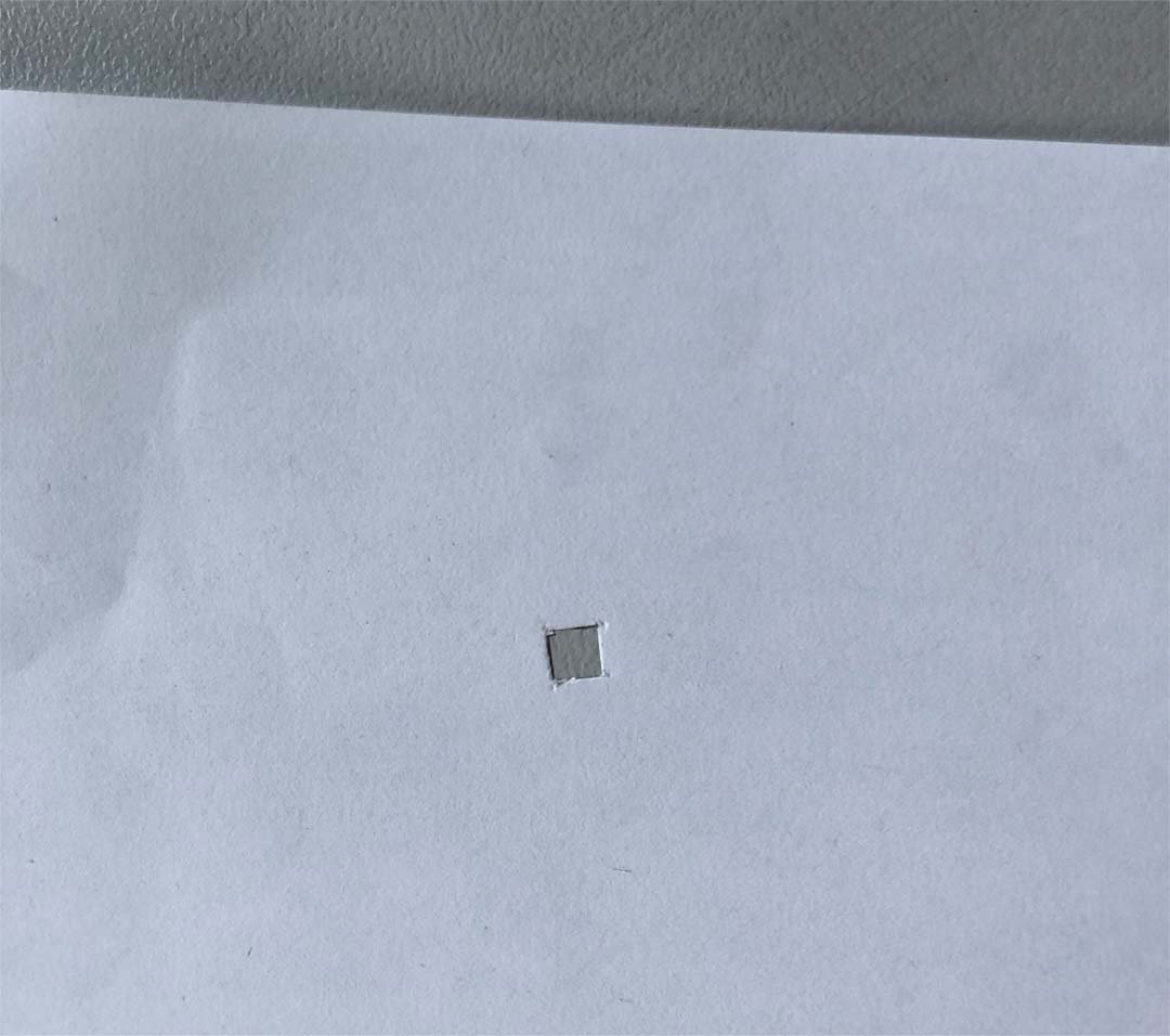
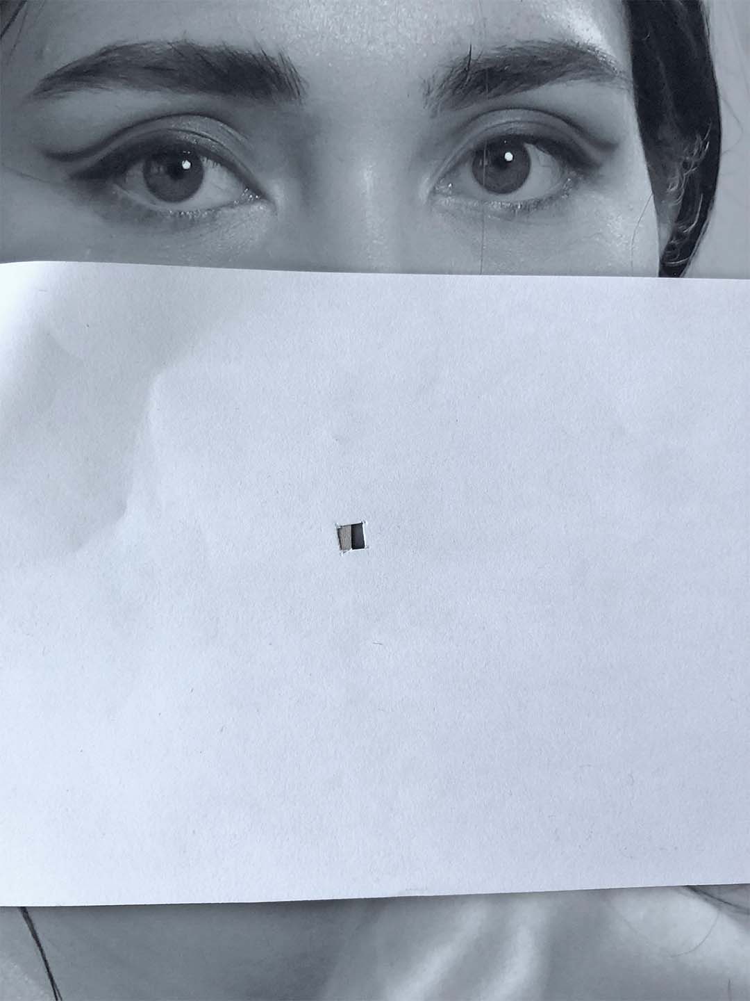
The key is to isolate the tone from its surroundings. As long as a value is influenced by nearby tones, your perception of it can be misleading.
A practical tool for this is a piece of paper with a small cut-out square. By placing it over your reference image, you isolate a specific area and can see its true value more clearly. This makes it much easier to determine which pencil grade is needed to match that tone.
When Drawing On Toned Paper
When drawing on toned paper, such as the Canson Mi-Teintes TOUCH Flanelle grey, we can make it even easier for us (easier is always good as it always makes the result better!) by taping a small piece of the drawing paper on the back of our square to cover half of it. You can use a piece of the actual drawing paper or match the tone of it using a graphite B pencil on a regular white paper.
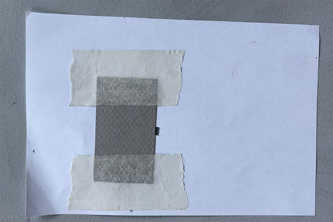
Now we can compare any tone in the photo to the grey tone of our drawing surface very quickly and stop the guess work. If it is slightly darker (use Derwent Light or Medium), quite a lot darker but still grey (use Derwent Dark), or is similar (no charcoal needed, or very little), if it is slightly lighter or much lighter (use General's White accordingly).
To make it easier to judge the tones, we can create a so-called posterized image of our reference photo and use it to identify the tonal values. You do not want to use it do actually draw from it.
To create your own posterized images, you can use our Posterize tool. Usually use 7 to 14 steps for best results.
Let me answer a few questions you may already have at this point.
How close do I have to be to the reference tone?
It is best to get close to the reference tone, but it does not have to be an exact match. There is some room for variation without disturbing the overall tonal relationships. In fact, when drawing with graphite, it is often helpful to stay slightly lighter. This makes it easier to maintain a balanced tonal range throughout the drawing. For that reason, if your reference photo contains many very dark tones, it can help to print it a little lighter.
When do I check the tones: before, during, or after the drawing?
I recommend checking the tonal values of both the reference photo and your drawing carefully before you begin and continuously while you work. In the final stage of the drawing, it is usually better to work with the tones you have already established rather than constantly comparing them to the reference. Only return to the reference tones at that stage if something feels off and you need to verify it.
Do I have to do this all the time from now on?
If you are a beginner, I strongly recommend using the square as often as possible. It trains both your eye and your artistic judgment. In my experience, the most common beginner mistake is ignoring the square and simply guessing the tones.
As you gain more experience, you will need it less often. That said, I still use it regularly myself.
I still have difficulty judging tones correctly.
That is completely normal. Like every skill in drawing, this improves with practice. Keep using the method consistently, and your eye will become more accurate over time.
What if I have already gone too dark in my drawing?
This is why it is so important to approach a tone slowly. Building up gradually helps prevent overshooting the value. Try to avoid making large areas too dark, because once a broader passage is overworked, it is very difficult to lighten it again without losing smoothness. Smaller areas and details, however, can often be corrected by gently dabbing them with a kneaded eraser to lift some graphite.
Which tones do I actually need to identify? There are so many.
Start by identifying the base tone of each larger form. In a portrait, for example, this could be the forehead, the face, or the neck. Choose the base tone from an area that appears to be neither strongly lit nor deeply shadowed.
If you draw on toned paper, identifying which areas are actually the paper tone is crucial for best results.