
We Need to Talk About Tones
by Dirk Dzimirsky
Does This Sound Familiar?
You carefully draw all the details. Your shading is smooth and well executed—yet the result still looks flat, like a drawing rather than a realistic 3dimensional image. It lacks depth and does not feel truly photorealistic.
If this sounds familiar, the issue is not skill or effort, but how you perceived and applied tones.
You most likely have not have paid enough attention to the accuracy of your tonal values, relying instead on what you thought you saw. Without realizing it, your perception has been misleading you. At the same time, you have not been fully aware of how crucial correct tones are for creating depth and realism.
First, let's look why you couldn't see the tones correctly
Because we naturally perceive everything in relation to its surroundings—whether proportions, colors, or, most importantly for us, tonal values (greys)—it can become surprisingly difficult to judge a tone accurately.
Look at the image below: the shading at the bottom of the figure appears brighter, even though it is exactly the same value as the one on top. The example is intentionally drawn in a simple, almost crude way to demonstrate that our brain does not need polished, realistic imagery to interfere with what we see. It constantly interprets and adjusts visual information for us—often leading to misjudgment.
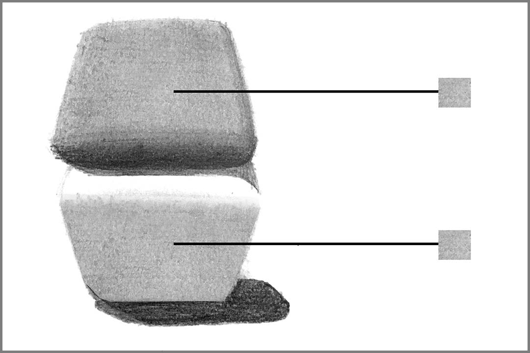
This effect is commonly referred to as an optical illusion. However, that term can be misleading. These “illusions” are not exceptions—they reflect how we perceive the world all the time. Our vision is always influenced by context, and understanding this is essential when learning to see and draw tones accurately.
Where This Affects Our Portrait Drawings
Let’s look at where this challenge commonly appears when drawing portraits.
A frequent source of misjudgment is the eyeball. It is often perceived as much brighter than it actually is—especially when surrounded by dark makeup or strong shadows. Even when you are aware of this and use proper measuring techniques, it is common to draw the eyeball too light. Your brain continues to interpret it as brighter than it truly is.
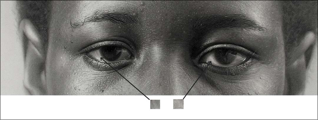
The example below compares the tone of the eyeball with another tone directly in the photo for better judgement while drawing.
Another very common area of misjudgment is blonde or white hair, as well as beards.
Although in shadow, the hair is still perceived as very bright—or even white but the real tones are different. As the example below shows, even what we see as the brightest parts of the hair are rarely pure white. They are usually subtle variations of light to medium grey.
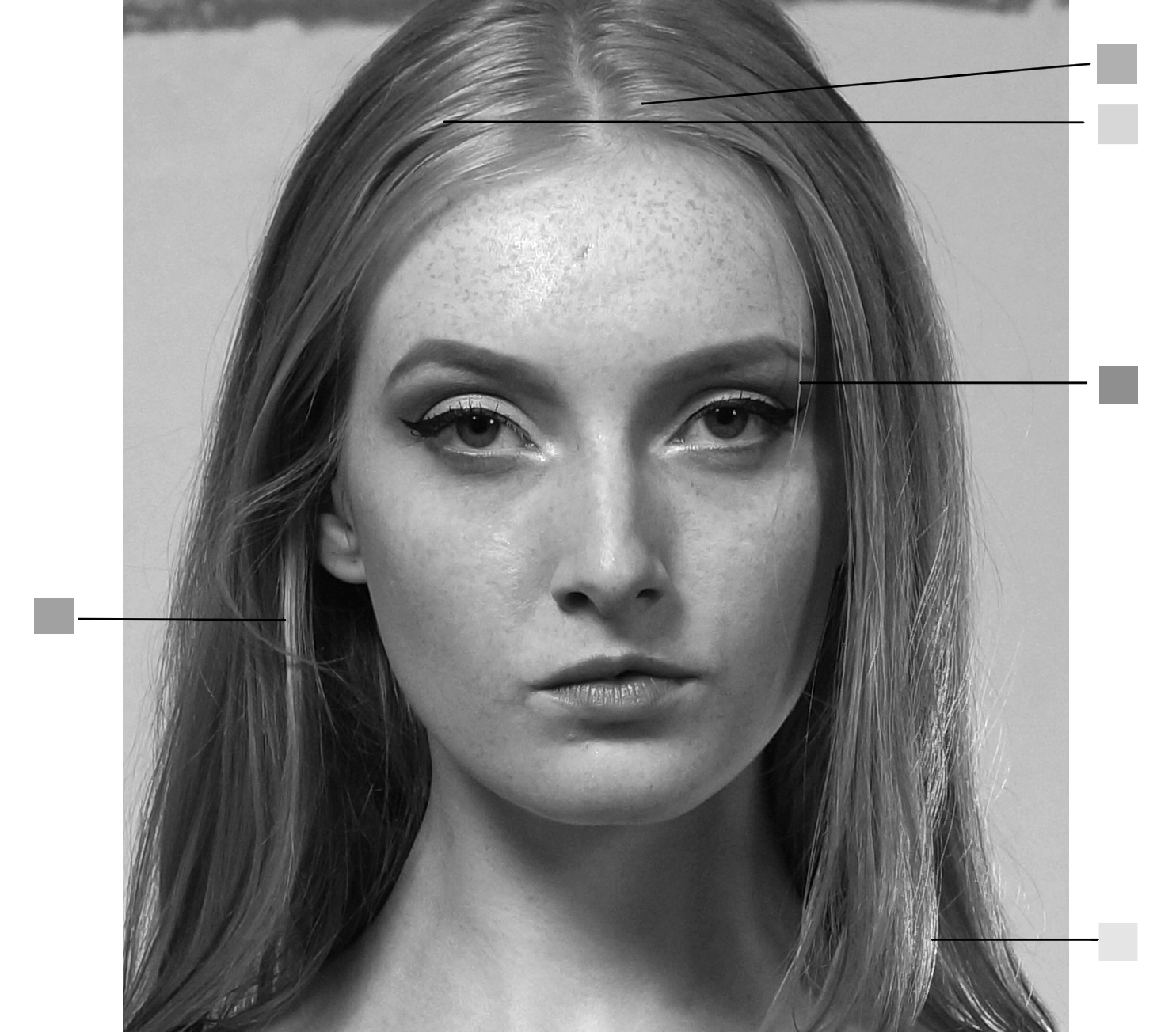
Notice how the two tones in the middle are perceived much brighter as they are surrounded by dark shadows.
This Applies to Color as Well
Although we are dealing with just grey tones usually, I want to point out that this “problem” is not limited to tones—it also affects how we perceive color.
Take the example below: as you may have guessed, both figures are made up of exactly the same colors, even though they appear different. Without an understanding of how our perception works—and without reliable methods to identify colors accurately—it would be nearly impossible to paint this image correctly.

And just like with tonal values, this is not something that only occurs in obvious examples. It happens constantly, every time you look at something—usually without you even noticing it.
Becoming aware of this is a crucial step toward gaining control over both value and color in your work.
How to Identify the Correct Tones
To draw accurately, you need a reliable way to identify tones (and colors, if you want) correctly. Fortunately, there is a simple and effective method.
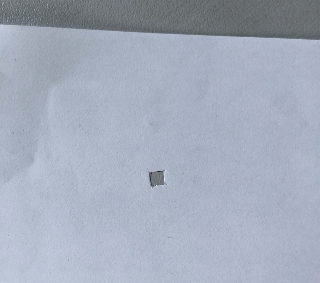
The key is to isolate the tone from its surroundings. As long as a value is influenced by nearby tones, your perception of it can be misleading.
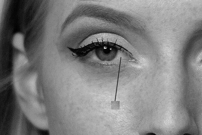
A practical tool for this is a piece of paper with a small cut-out square. By placing it over your reference image, you isolate a specific area and can see its true value more clearly. This makes it much easier to determine which pencil grade or pressure is needed to match that tone.
In the next lesson, you will learn how to integrate this tool into your daily drawing process and what tones to focus on when working with it.